Fonts are pretty cool, aren’t they?
They just are. Evidence exists of human writing systems from over 5000 years ago, from ancient Mesopotamia. Writing has been invented independently at least four times across multiple different early civilisations. This means we’ve been doing it a very long time. It’s as central to the fabric of human experience as ceramics, farming and wheeled vehicles. Means to say, we’ve had a lot of time to get really, really good at written words.
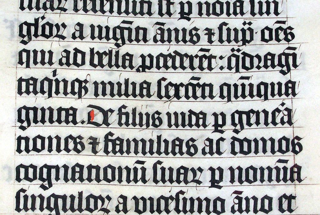
Typefaces are a lot more modern, originating alongside the printing press in 1440, though hand-crafted, standardised lettering was well established by this point (12th century Gothic script, for example). Standardised letters have been long used for speed, cost and clarity – they developed as a necessity in response to the increased demand for the written word, often in the form of legal, historical and religious texts.
Now this piece isn’t historical, so I shan’t be including footnotes, however I’ve aimed to convey only the basics, not delve into historical enquiry, in order to avoid offending my old university professors. If I’m wrong about any of it, please tell me.
In the same vein as the printing press, computing enabled an even greater speed in producing lettering, and of a far greater variety. Much can be said about the advent of Letraset’s sheets of typefaces, and how they impacted graphic design, but the ubiquity of the personal computer, like the one I am using now, is what handed the creation of text to anybody who has access to one (which is around 50% of the global population – still far too low as far as I’m concerned). The inkjet printer also has a lot to answer for as well – flooding the world with paper covered in Arial and Comic Sans.
My earliest memories of typing lay with Microsoft Word and the very well known Times New Roman font, which used to be the default for 15 years prior to the divisive (yet actually quite good) Calibri being introduced in 2007. Times New Roman, a fairly compact serif font (meaning a font containing flourishes and strokes at the edge of its lines) which were standard for printed documents. As most documents were printed in 1992, rather than read on a screen, it was a sensible choice. Sans-serif fonts, like Calibri – lacking those strokes – look very clear on screens, so the decline in printed documents made Calibri an equally sensible choice in 2007. Microsoft’s suite of fonts are no doubt seared into the minds of many who grew up using Windows XP at school.
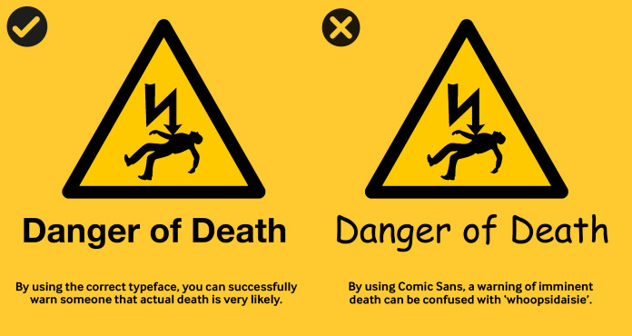
Of course, word processors have many fonts available. From Comic Sans to Papyrus, from Helvetica to Palatino – choosing a font remains part of the process of creating a document. The fonts we choose say something about our writing, they convey individuality and tone. As a society we have even adopted generalised opinions about specific fonts – we regard Comic Sans with mockery, and Arial with boredom. Yet, we all have our preferences.
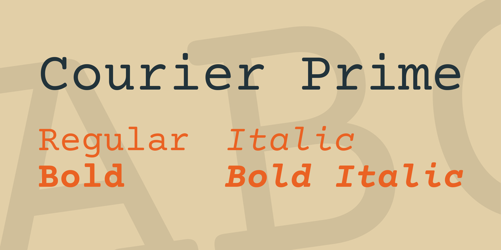
I only write fiction in Courier, for example. Courier Prime, specifically. It’s monospaced, which makes it easy to read on a screen while bleary eyed at two in the morning.It’s also a serif font, which makes it looks good on paper. Courier conveys a nostalgic tone that helps me relax into the rhythm of the mechanical keys as I type. I may not be sitting there with a typewriter, a mug of strong black coffee, and a cigarette, but it helps me feel like I am.
This is what fonts do, they are far beyond just written words, and even ignoring their use in marketing (Apple used to use a serif font, now they don’t) their impact on an individual’s life if remarkable. When Andy decides to apply for a job, he writes his CV title in Cooper Black – and your reaction to that statement is going to depend on what job you think he’s applying for.
That is utterly fantastic.
Here’s a few of my favourite fonts…
- Courier Prime: Classic and stalwart. I can hear the thunder of typewriters just looking at this font. As a monospaced design, every character takes up exactly the same amount of space. This makes it great for writing computer code as well as literature. Prime is the newer take on this font, the original Courier is from 1956 and was used for IBM’s typewriters. Slab-serif fonts like Courier date back to the 1800s, and could be seen everywhere, from newspapers to posters.
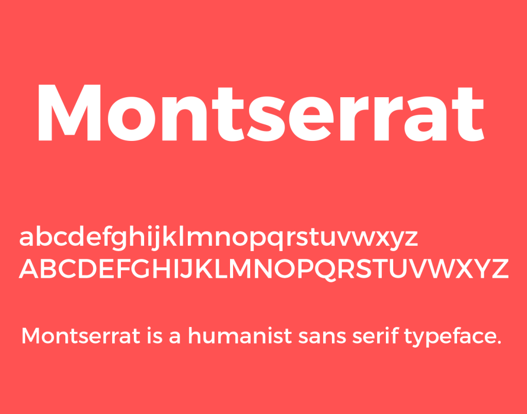
- Montserrat: Nothing to do with it being my work’s brand-compliant font in Google Docs, it’s just super clear and pleasant to look at due to being so rounded and open. It was inspired by the urban typography in Montserrat, Buenos Aires, which explains the readability.
- Cooper Black: I rarely use it but it’s just utterly delightful in its construction (look at the O). It’s been somewhat overused, but I strongly encourage you to watch this video from Vox about the typeface and why it rocks.

- Ubuntu: This site’s font of choice for body text at the time of writing – most commonly seen in the Ubuntu operating system, it is rounded, clear, and visually interesting. In the operating system itself, this font provides the whole user experience a cohesive experience that really does reflect Ubuntu’s personality.

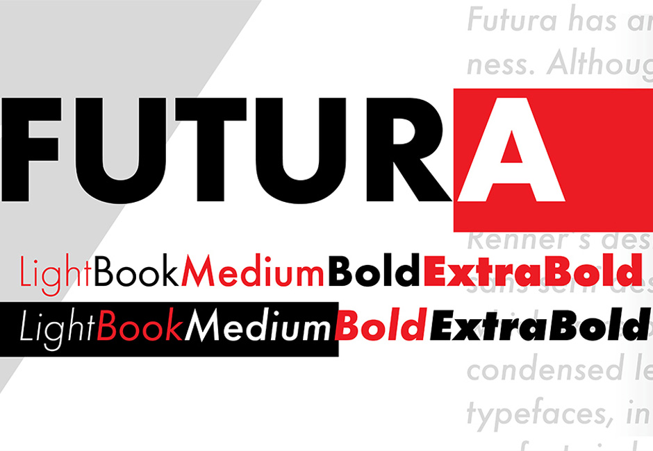
- Futura: Again one I rarely use because it’s quite situational. However, it manages to condense the futurist, utopian ideals of 20th century modernity into a single typeface. I love that. It’s in a lot of Bethesda games. Again, Vox did a pretty good video on this one.
Next time you open Word, or Pages, or Docs, have a look at the font list. Don’t just use the default without thinking. Ask yourself what you want your document to say and go with what looks right to you. Fonts are a visual art, and you don’t need to be an expert to identify an appropriate option. Even if you’re the only person who will ever look at that document, isn’t it better to have your words captured with the right characters?
I’d love to hear what fonts you like to use, and perhaps ones you really hate to see. Pop a comment below! You should also check out Google Fonts, everything available there is free to download and use.
